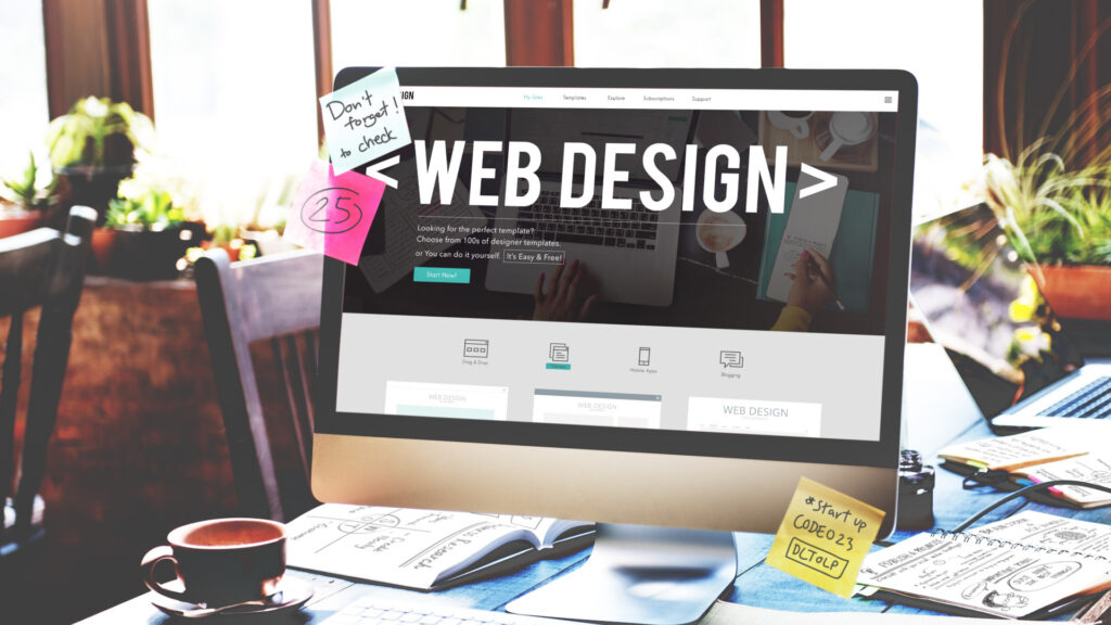
There are several factors to consider while designing a stunning web design in Melbourne.
It’s normal for some components to go neglected while selecting pixel-perfect background photos and creating a fantastic colour scheme. However, the fonts used on your website are one aspect you should not ignore.
Typography is the glue that binds all the UI design components together; it is not the crowning glory of a stunning website. However, deciding on which font best suits and stands appropriate for your web design can be difficult when there are thousands of options available.
Here’s a comprehensive guide you can follow to decide on the ideal font combinations:
- Get inspired
- Reflect on personality, tone, and branding
- Less is more
- Assess the readability
- Make sure the fonts are scalable
- Be mindful of font load times
- Final thoughts
As you begin looking through fonts, consider the following stages as a checklist of things to check off.
1. Get Inspired
While analysing, you might have considered a few fonts to use, but taking time to look at what other experts are following is a great way to finalise fonts. You will find many websites on Google where you can explore font ideas as per your web design. Typewolf, Fontpair, and Google Fonts are some options that you can surf for some inspiration.
You may get some solid ideas about what’s out there, even by searching for typography on Pinterest or following typography hashtags on social media.
2. Consider Branding, Tone, and Personality
Even though you have listed a few font ideas for your web design in Melbourne and need to finalise one, the Internet has infinite options to offer, which can confuse you anytime. So, how do you choose the perfect font idea? Begin with considering your branding, tone, personality, and what your audience might like.
When visitors first arrive at your website, how do you want them to feel? Do you wish to simulate a welcoming environment? Do you like the website to have an upscale, friendly, lighthearted, or sombre vibe? Will your website be mostly text- or visually-driven (with images, animations, and videos)? It will be much simpler to choose which typeface best suits your product and message once you have addressed these issues and selected a few.
3. Less is More
Using several typefaces in one design may seem appealing, but it can make the interface look cluttered or overpowering. We advise beginning with a single typeface or fonts from the same family. Maintaining a single typeface will make your interface appear more unified because fonts from the same typeface were designed to complement one another. Try to stick to no more than three typefaces if you’re a little more seasoned with typography or determined to use more than one.
Sticking to one or two typefaces shouldn’t make you feel constrained because there is enough variety to give you plenty of font options for various uses. A web design font should hold the capability to have enough variations so you can select at least primary, secondary, and tertiary fonts. Categories to follow:
- Primary font: Your primary font will be the most noticeable on your page and should be used for all larger text, including headings and logos. Since it’s crucial that it conveys the brand’s identity, you can choose your primary font with a little more imagination and boldness.
- Secondary font: The body of your article will be written in your secondary font. Since your secondary font will be used for any articles or descriptions on your page, they should be clear and strain-free.
- Tertiary Font: Accent typefaces are most frequently utilised for particular website features, like a call-to-action button or navigation menu. They should be sufficiently noticeable to draw in users and communicate crucial information but not so evident as to overpower or interfere with your primary and secondary typefaces.
4. Access the Readability
Readability should be the top consideration when selecting a font for web design in Melbourne, particularly a secondary font. Certain typefaces are seen to be easier to read than others.
Georgia and Times New Roman typefaces are among the most widely used serifs. If a serif font is more in line with your preferred style, these default font types are considered very readable and a fantastic place to start.
Sans-serif fonts are known for having a more contemporary and clean design than their serif counterparts, which generally means they lend themselves better for reading material on digital interfaces. Serif typefaces, the preferred option for print, are traditionally praised as more legible. Sans-serif fonts that are easy to read include Helvetica, Futura, and Arial.
5. Ensure Content Scalability
While typefaces with extremely fine letterforms or highly ornate motifs may fracture in smaller settings, some are discernible when viewed at higher proportions. A crucial first step in integrating typography into your user interface is making sure your fonts are scalable.
Fonts that may be resized or shrunk without causing distortion are called scalable fonts, outlier fonts, or vector fonts. Each character’s outline is saved as a mathematical formula. Scalable fonts provide the added benefit of maximising the resolution of an output device in addition to providing an infinite number of font sizes. A scalable font will seem better on a display with higher resolution.
Make sure to use actual text instead of a Lorem Ipsum placeholder when testing the scalability of your typefaces in your interface. This will help you get a more accurate sense of their scalability.
Conclusion
These were the five essential points to consider when framing a web design in Melbourne. If you want your website to get professionally designed, connect with Make My Website today, and let us help you get the best website with perfect font settings.


